" transform="translate(4 5)" width="16px"/></svg>)
Scope & timeline
Industries
Team
My Role
Contribution
Tools
Overview
Bridgefy came to us with a clear brief — refresh the logo, strengthen visual recognition, and improve the overall UX. The product was built on the team’s existing modular framework, so every design decision needed to work within those constraints.
My scope covered the brand identity redesign, UI/UX improvements, and a client management dashboard — all delivered within 4 weeks.


Redesign Logo & color
The original logo lacked clarity and didn't support the client's future direction. Running the brand work in parallel with UI/UX, I aligned on direction in week one and built a cleaner identity system from there.


Define & Research
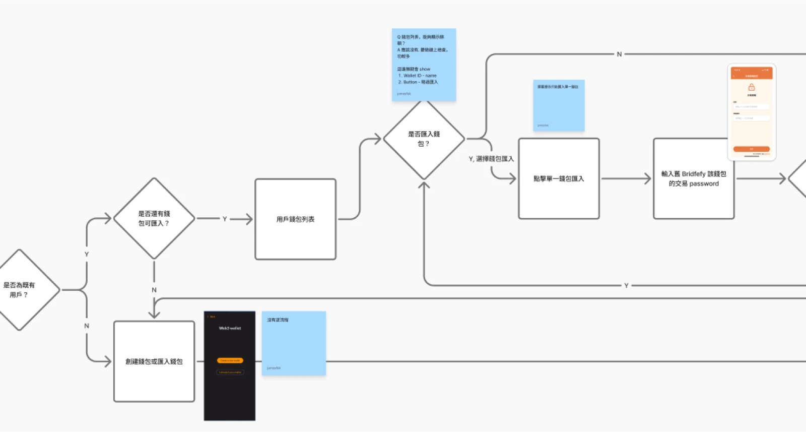
Priorities were set based on team readiness. The Bridge flow — converting USDT from Liquid into other chains — was the core feature and clearest starting point, so I tackled it first.
Wallet migration required further client discussion, and KYC details were still being confirmed. Since KYC was relatively straightforward, both were deprioritized without blocking the team’s progress.
Onboarding process
UI/UX
Covered four core flows:
Bridge USDT from Liquid chain to other chains
Wallet migration for existing users
KYC onboarding
Operations management platform
For each flow, I mapped the user flow, explored layout directions, and iterated based on team feedback — keeping interactions simple and clear within the existing framework. Especially for the Bridge flow, where trust and transparency are critical in a crypto context.
Final screens were delivered with detailed annotations to support a smooth developer handoff.
Challenges
The team's existing modules and product created constraints early on. When requirements conflicted, I worked with the team to find practical workarounds — avoiding rebuilds and rework where possible.
The Bridge flow required an external API integration — specs went through multiple rounds of back-and-forth, and the UI adapted along the way.
Scope and priorities shifted during the project, but the team stayed flexible — quickly re-evaluating focus areas to keep delivery on track.
Design

Transaction flow

Import wallet

KYC onboarding
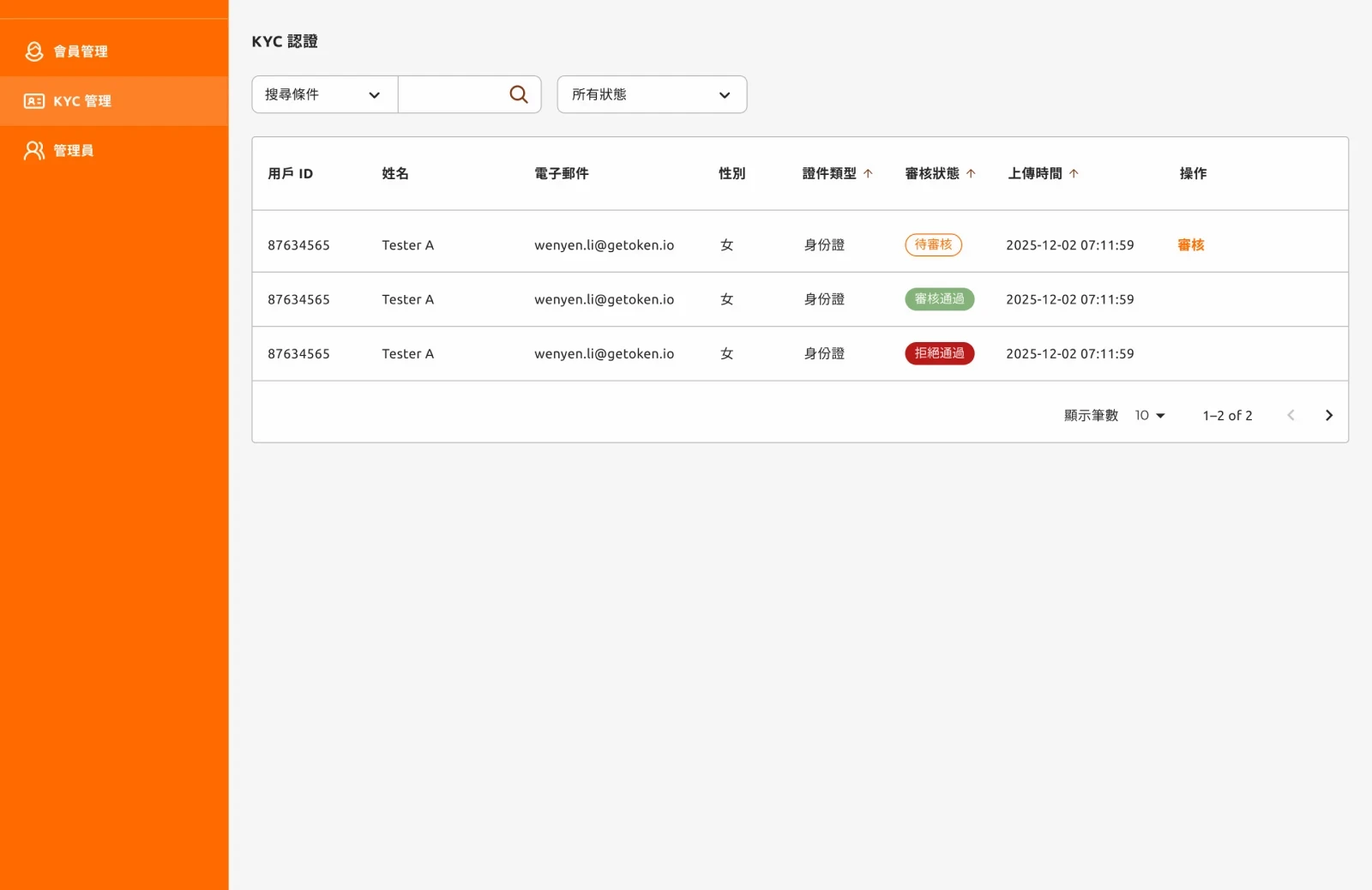
Operation management dashboard.
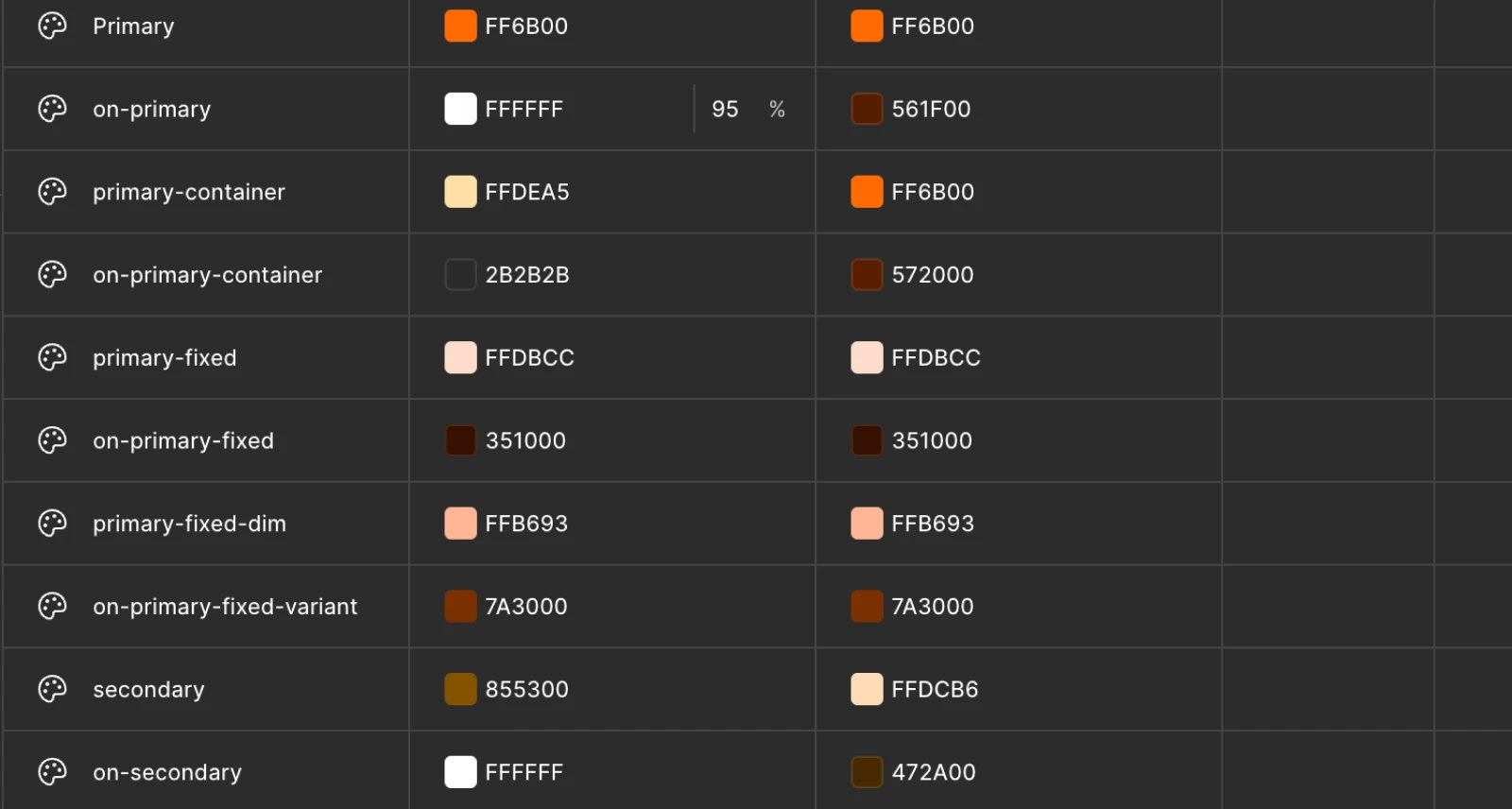
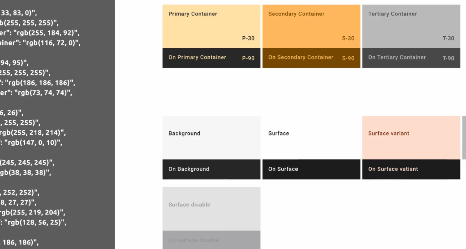
Design System
To support both speed and consistency, I built a lightweight design system aligned with the team’s existing framework.
It covers typography, color tokens, components, and layout variables — giving designers and engineers a shared language to work from. Color tokens were structured for CSS export, minimizing rework during developer handoff.
Collaboration
I worked closely with the PM, front-end, and back-end developers throughout the process — reviewing flows, aligning on constraints, and adjusting directions as needed.
Design decisions were always tied to product impact, which helped the team stay focused and move forward with shared priorities.
Impact
The redesign gave the product a clearer foundation at a critical MVP stage — a more consistent visual identity, smoother core flows, and a design system the team could build on.
Keeping scope focused and trade-offs explicit allowed the team to ship with confidence. The improved visual quality also strengthened the client’s trust, creating a more positive dynamic for future discussions and iterations.