Spiritz explorer
Your spirits drinking assistant
0-to-1 App product design and operations support
Background
What's next? Find the right bottle.
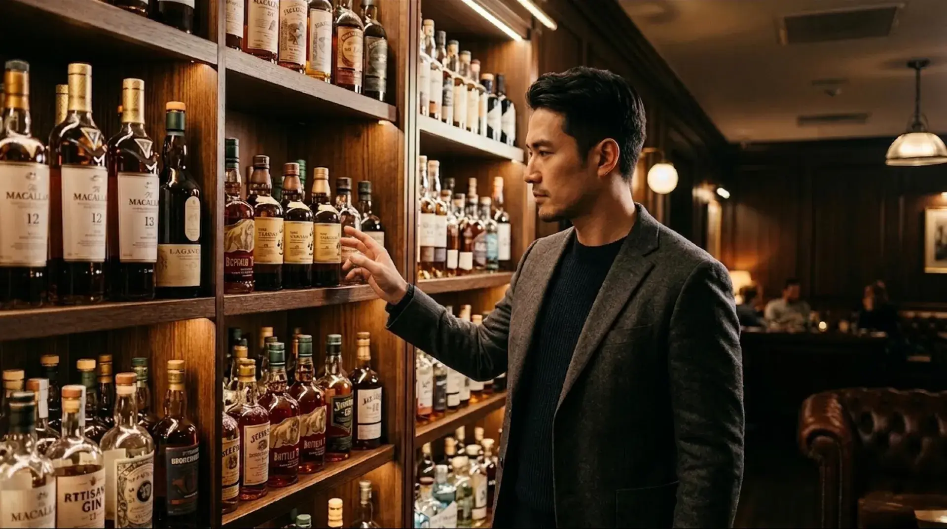
Imagine you're Taiwanese, standing in front of a liquor shelf. How do you decide which bottle to pick? Most labels are in English. Spirits info is scattered everywhere. Finding the right bottle takes time and luck.
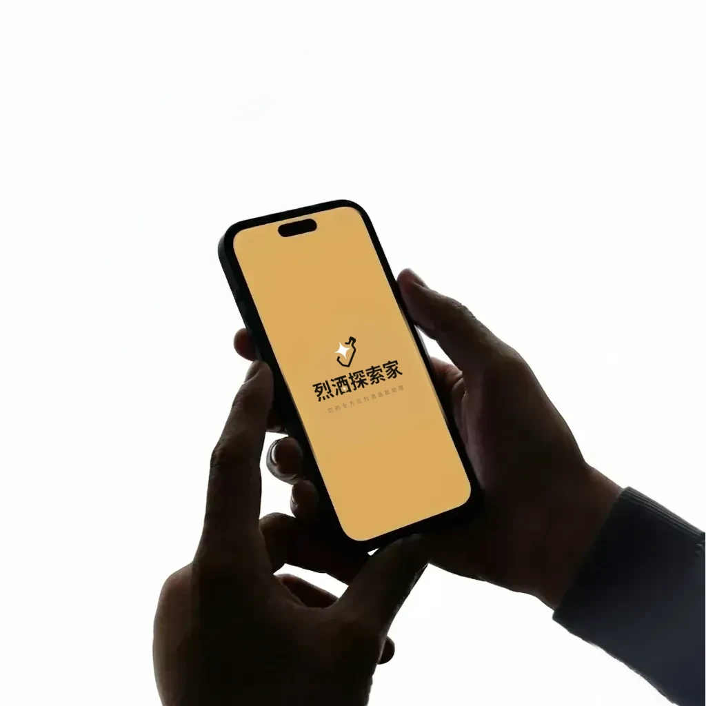
Spiritz Explorer is an app helps users quickly find spirits information and log tasting notes.
Device
iOS/Android/PWA
My Role
UI/UX Design
Brand Identity & Visual Design
Research & Test
Expert interview
Prototype
Timeline
2023 - 2024
Team
1 Designer, 1 Project Manager, 2 Engineers
" width="17px"><path d="M 0 6 C 0 6 2.55 0 8.5 0 C 14.45 0 17 6 17 6 C 17 6 14.45 12 8.5 12 C 2.55 12 0 6 0 6 Z" fill="transparent" height="12px" id="WwGMWQxcq" stroke-dasharray="" stroke-linecap="round" stroke-linejoin="round" stroke-width="1.5" stroke="rgb(255, 255, 255)" transform="translate(0 0)" width="17.000000025331985px"/><path d="M 0 2.571 C 0 1.151 1.142 0 2.55 0 C 3.958 0 5.1 1.151 5.1 2.571 C 5.1 3.992 3.958 5.143 2.55 5.143 C 1.142 5.143 0 3.992 0 2.571 Z" fill="rgb(255, 255, 255)" height="5.142857174484101px" id="a9RuzNtBQ" transform="translate(5.95 3.429)" width="5.10000000759959px"/></g></svg>)
Vision
Make finding spirits and tasting notes easy.
" transform="translate(6.395 5)" width="11px"/></svg>)
Goal
In the early stage, validate demand, build traffic, and grow the database. In the later stage, turn database depth into business value for users, distributors, and brands.
1. Build Traffic
3. Convert Value
2. Grow the Database
" width="15.000000107288372px"><path d="M 0 2.333 C 0 1.045 1.007 0 2.25 0 C 3.493 0 4.5 1.045 4.5 2.333 C 4.5 3.622 3.493 4.667 2.25 4.667 C 1.007 4.667 0 3.622 0 2.333 Z" fill="transparent" height="4.666666666666666px" id="hPFk1UUoC" stroke-dasharray="" stroke-linecap="round" stroke-linejoin="round" stroke-width="1.5" stroke="rgb(255, 255, 255)" transform="translate(0 0)" width="4.500000124673079px"/><path d="M 0 0 L 0 9.333" fill="transparent" height="9.333333333333334px" id="EPAwURTBB" stroke-dasharray="" stroke-linecap="round" stroke-linejoin="round" stroke-width="1.5" stroke="rgb(255, 255, 255)" transform="translate(2.25 4.667)" width="1px"/><path d="M 0 2.333 C 0 1.045 1.007 0 2.25 0 C 3.493 0 4.5 1.045 4.5 2.333 C 4.5 3.622 3.493 4.667 2.25 4.667 C 1.007 4.667 0 3.622 0 2.333 Z" fill="transparent" height="4.666666666666668px" id="EO3fGPvwu" stroke-dasharray="" stroke-linecap="round" stroke-linejoin="round" stroke-width="1.5" stroke="rgb(255, 255, 255)" transform="translate(10.5 9.333)" width="4.500000107288372px"/><path d="M 2.25 4.667 L 0 2.333 L 2.25 0" fill="transparent" height="4.666666666666666px" id="L0wperhWx" stroke-dasharray="" stroke-linecap="round" stroke-linejoin="round" stroke-width="1.5" stroke="rgb(255, 255, 255)" transform="translate(7.5 0)" width="2.2500000536441576px"/><path d="M 0 0 L 3.75 0 C 4.578 0 5.25 0.696 5.25 1.556 L 5.25 7" fill="transparent" height="7px" id="VBWi8JFZf" stroke-dasharray="" stroke-linecap="round" stroke-linejoin="round" stroke-width="1.5" stroke="rgb(255, 255, 255)" transform="translate(7.5 2.333)" width="5.250000125169777px"/></g></svg>)
To reach these goals, the design strategy was
Simplify the search process, organize information hierarchy, and break down the tasting note flow so users at all levels could use it with ease.
Impact & Achievements
From 0 to 1, we validated the market under limited resources and kept iterating to reach these results:
Reduced search time by 65%+
Average search time was over 3 minutes. The flow I designed cut it down to about 20 seconds.
App rating improved by 25%+
I used data to optimize the scan, tasting note, and review experience, making each step more satisfying.
CR% stayed above 30% over time
I worked with marketing to create ad materials. CR peaked at 40%+, confirming market potential and target audience.
1300+ user-submitted entries
I built the reporting flow and review SOP, helping the product hit its target for number of spirits listed.
Problem & Solution
Problem
Hard to find Chinese information and reviews for spirits. Scattered content is difficult to absorb.
Why?
1
Instant scan to find reference info
Find spirits info within a minute and lower the first barrier to searching.
2
Quick rating with guided note-taking
Break down logging steps, offer one-tap rating, and guide users toward deeper entries within the flow.
3
Structured info with multi-level search
Simplify how spirits info is organized and provide entry points for different search depths.


Design Process
Centered on user needs and business goals, we started from zero, quickly explored and built hypotheses, and pushed design and validation forward at the same time. We built a complete tool flow to solve the spirits search problem.
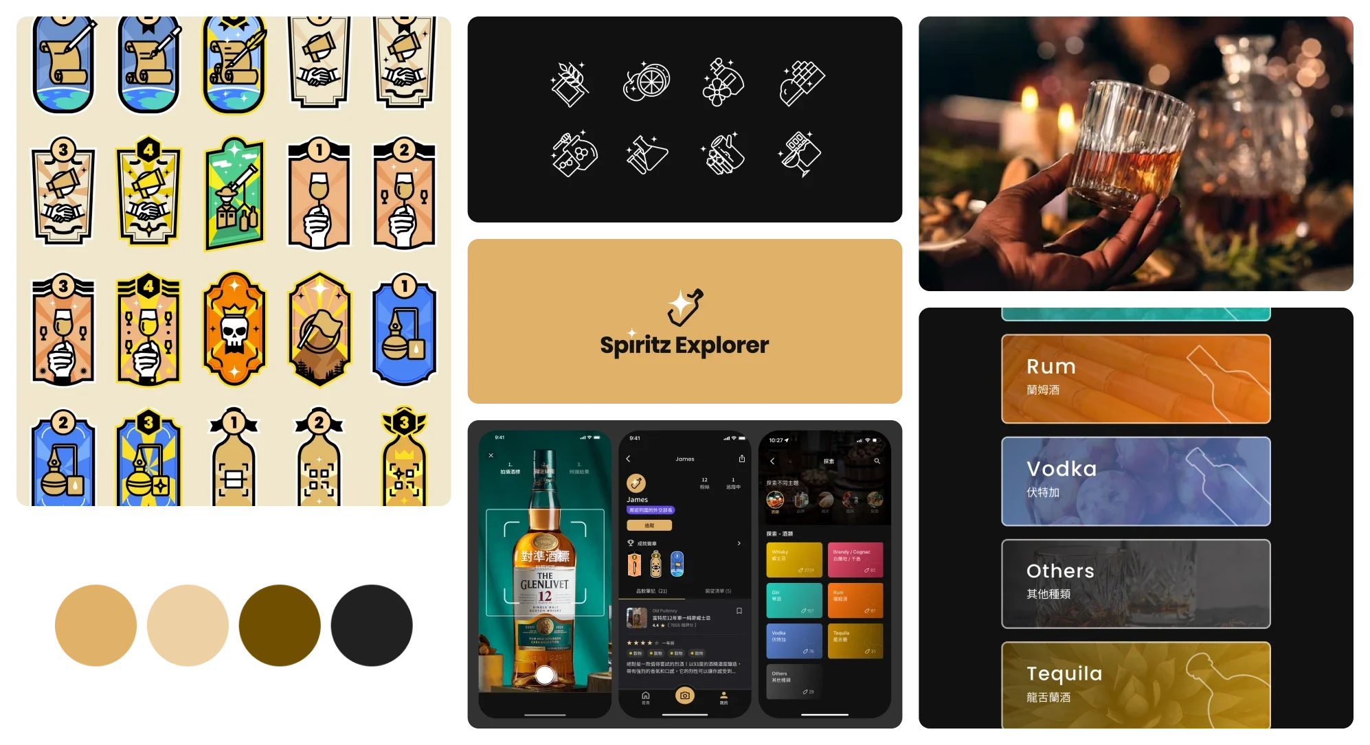
Logo、Color、Naming proposals were done in parallel. This is part of the brand work and is not covered in detail in this UX case study.
In short, I set the differentiators, recognizability, and key terms first, then extended them across applications.
Research
This was a 0-to-1 product. The client provided a basic user profile. Starting from the difficulties users faced, spirits information architecture, and tasting flows, I defined the key information that affects user experience and business metrics.
Research Goals
Clarify the core feature scope for a 0-to-1 product
Plan the information architecture
Plan spirits and tasting information
My Questions
Spirits info is complex. What do users actually need?
For spirits search tools on the market, at what point do users give up?
Methods
Analyze competitor features and information architecture
Conduct spirits expert interviews
Study community tasting post structures
Learn the tasting flow
Scan accuracy directly affects user retention
Market products use three search methods: label scan, barcode scan, and search engine. Negative reviews showed that low accuracy likely causes frustration, but iteration is almost always required.
Action
Instant scan, improve hit rate
Prioritize scan accuracy by designing a capture guide to reduce noise and building a reporting system to fill gaps in the database.
High learning cost for tasting notes
Spirits info is complex. Most sources are in foreign languages, making it costly to learn.
Action
Quick rating, guided note system
Break the tasting flow into smaller steps to reduce cognitive load and friction.
The Chinese-language market lacks structured content
Complete spirits info requires visiting foreign-language sites. The language barrier makes it hard for beginners to absorb info and make decisions.
Action
Structured info, multi-channel search
Simplify complex info, prioritize useful content, and build a habit of reading structured information.
How User Look
User profile from research

・Aged 30-55
・Experienced & Novice, Casual & Proactive
Who are they?
Beginners and experienced drinkers. Features range from light to deep based on skill level and interest.
Whose bottle?
Bottles I have tried, bottles I want to try, and bottles others have tried. Features and flows are planned around these.
Want to find info fast
Typing is a hassle. A lot of info is scattered across different places.
Want to find the next bottle
Hard to judge how reliable the information is
Want to log and share tasting notes
No idea where to start. Writing takes time. Logging is a hassle.
User Journey - Search spirits
Typical online spirits search, over 3 minutes
Product search journey, under 1 minute
Challenge 1
Improve scan accuracy
The scan is the entry point for the entire product. If a user cannot find a bottle, they leave right away. But technically, scans can never be 100% accurate. Forcing a single answer only amplifies the feeling of failure.
So the design strategy was not to chase accuracy but to chase a hit. We moved from a single result to ranked similar results, so the first or second item would be a match.
User review
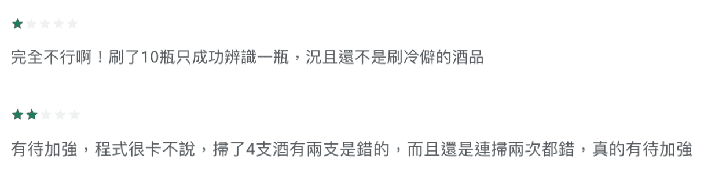
Translate:
"Only 1 out of 10 scans succeeded, and these weren't even niche products. Very disappointing."
"I experienced a 50% error rate (2 out of 4 bottles), and the errors persisted even after re-scanning."
😔
Data and feedback showed low scan accuracy.
Backend data and App reviews both confirmed the problem: scan accuracy was only 60 to 80%. Users who could not find their bottle dropped off or became inactive.
The data pointed to the problem. The fix was not to ask engineers to improve accuracy. It was to find the variables that design could control.
👍
Guide users to take photos that help the model scan better
The quality of input to the scan model determines output accuracy. I identified image noise as the most controllable variable, so I optimized the capture guide to focus prompts clearly on the label area.
Engineers handled model testing and validation. After launch, I kept checking the backend to review actual user photos. Once I confirmed that noise had reduced significantly, I determined the intervention was effective.
👍
Changed results from a single match to multiple similar options
The same spirit can have multiple versions. Results can never be certain. The design shows multiple similar results, aiming for the first or second to be a hit while testing different scan models to maximize the hit rate.
Design thinking
Identify the Problem
Find Controllable Variables
Design an Intervention
Validate with Backend Data
Stronger guidance below with clear copy
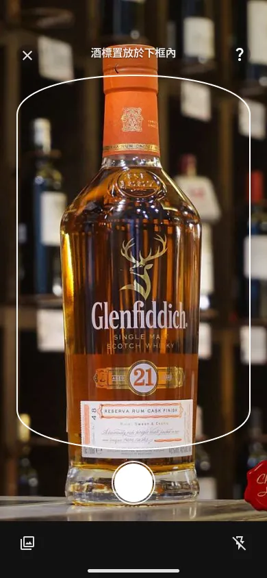
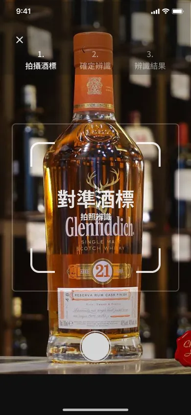
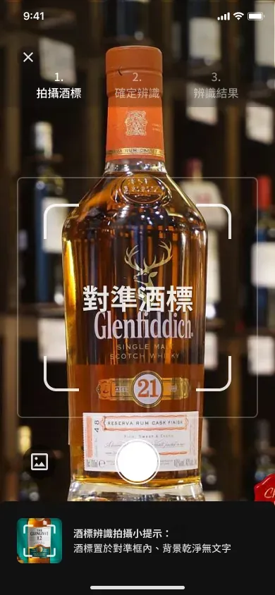
The first image is the original design. The second is the initial launched version. The third is the current version.
Changed from a single result to multiple results, ranked by similarity, with improved information hierarchy
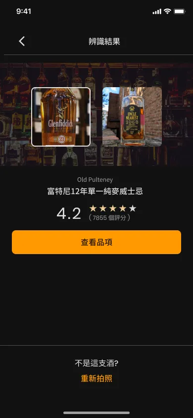
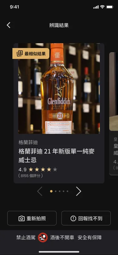
The first image is the MVP design. The second is after revision.
Instant scan

Guides users to take a clear photo for identification.
Results
Improved accuracy to 90%+
Fewer negative reviews
50%+ of members use the scan feature
Challenge 2
Grow the number of spirits listed
The number of spirits listed is one of the core product metrics. It directly affects the user experience when searching and the platform's value as a reference.
🤔
Brand licensing takes a long time. How can design keep more spirits being added?
Think about how to let users contribute with minimal effort, and let the backend fill in the rest.
☹️
Users reported that there are too few spirits listed and the review process is slow
Both factors reduce the chance of users finding what they are looking for.
👍
One-tap reporting for bottles not found, to lower the reporting barrier
The reporting action itself has a high barrier. Assuming users have limited motivation, the design rule was: no filling in fields. One tap to submit a photo. The backend fills in all the data.
Three entry points (scan, text search, my cabinet). Resources were focused on the scan path first because it has the lowest friction and collects the most complete photo data.
After launch, the text report rate was very low, which confirmed this assumption.
Users have limited motivation
Users do not need to fill in anything
Scan path first
Validate the assumption
Scan the label
Report not found
Backend receives the report and processes it
Ask if the photo can be used as the cover image
Report right away. Do not make users think too much.
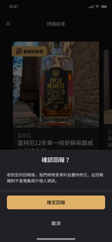
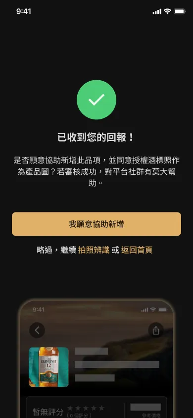
One-tap reporting. Users do not need to do anything extra.
👍
Plan the backend flow and features
Reports kept piling up in the backend but there was no dedicated reviewer. I stepped in, reviewed the data myself, and put together an SOP at the same time. Once done, I handed it over to the client so operations would not depend on me alone.
The last step in the flow notifies the reporter. Letting users know their report was handled increases the chance they will report again.
Reports kept piling up
Lack of standardization
Proactively review data and build the SOP at the same time
Report processed
Receive report info
Quickly check if the spirit is already in the database
Fill in the info
Add materials to help the scan model
Publish and notify the reporter
Result
Challenge 3
Balance speed and depth in the tasting note feature
More quality notes are better for the platform. But forcing users to fill in fields reduces motivation. Full freedom leaves users unsure where to start. The design goal was to let casual users finish quickly and let power users go deeper naturally.
🤯
Not sure where to start. Logging takes time and is a hassle
Let users do the least. Let the backend fill in the rest.
👍
Structured flavors
Combined flavor wheels, consultant input, and user feedback to build a structured flavor tag system. Added autocomplete so users can quickly find the right flavor.
👍
Layered rating options
One-tap submit is the default. Tapping naturally expands secondary dimensions, letting users go deeper as they get comfortable, without pressure.
👍
Most valuable info first, from light to deep
Referenced local and international masters' tasting flows (such as Charles MacLean and Lin Yi-feng) and studied in-depth tasting posts from communities to plan a useful information structure. The top three indicators are overall rating, secondary rating, and flavor.
The initial plan only had an overall rating. After I studied the tasting process in depth, I proposed adding aroma, flavor, and finish. I convinced the team by citing standard dimensions from master tasting flows and the low development cost, improving the professional value of notes without adding much work.
Willingness to fill in & data quality
Secondary Rating: Default State
Default expanded
95%+ filled in secondary rating
Assume users are willing to fill in
・More data dimensions → higher note value → better acquisition and retention
・Matches the tasting flow. Quick notes by dimension make it easy to go deep or recall later.
Default expanded
Selected
Assume only advanced users will expand and fill in on their own
Default collapsed
Not selected
After completing the main rating, auto-expand to guide filling in and reduce pressure in stages
Break into steps
Not selected
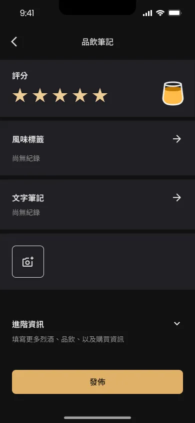
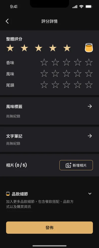
The first image is the original design. The second is the current version.
Quick rating

One-tap rating. Log quickly.
Structured notes
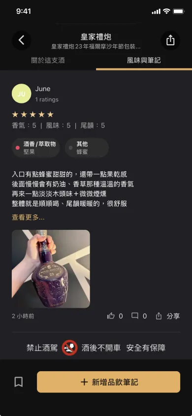
Read key info quickly.
Results
4000+ notes logged
1 minute from scan to rating
95%+ of users filled in secondary ratings
Appendix
UX writing
I wrote all copy first, then finalized it with the PM. The process was clear with very few revisions.
The core judgment was based on the user's current situation. In a spirits context, users may be drinking. Task-based copy must communicate fast and precisely, without making users stop to think. I led decisions on the balance between design and copy.
When producing large amounts of spirits content, I used AI prompts to organize and handle the volume.
1. Task-based copy should be simple and clear, so users complete actions without hesitation.
2. Think from the user's state within the product context. In a spirits setting, prioritize fast delivery.
3. When space allows, full expression takes priority over forced brevity.
4. Use a friendly, encouraging tone for prompt states to match the product's voice.
Copy decision example: For the spirits intro section title, candidates included "關於", "介紹", "酒故事" and "背景". The final choice was「關於這支酒」。
Reasoning: "關於", "介紹" have no object,so the meaning is incomplete. "酒故事" & "背景" too vague. Layout space allowed for a full expression. "這支酒" fits everyday Taiwanese speech and feels natural.
Content Strategy
Copy Quality
Ad material testing and optimization
Tested multiple ad materials, analyzing the relationship between visual combinations and messaging across four metrics: impressions, clicks, installs, and CPI. Found that the connection between ad messaging and the post-click flow directly affects conversion, which became the direction for future materials.
Strategy: single message, focused theme, simple elements, clear CTA.
Lead with product highlights. Write copy from the target audience's point of view.
Insight:
1. Copy that shows the product experience had the best install numbers. This suggests a stronger connection to the app flow.
2. No notable difference between light and dark versions.
3. Compared to download-for-gift messaging, simple feature descriptions plus a direct download prompt performed better.
Result: CPI reduced by 25%+
Countdown copy also performed better. Urgency drives action.
Find the best material combination
Understand the link between messaging and the conversion flow
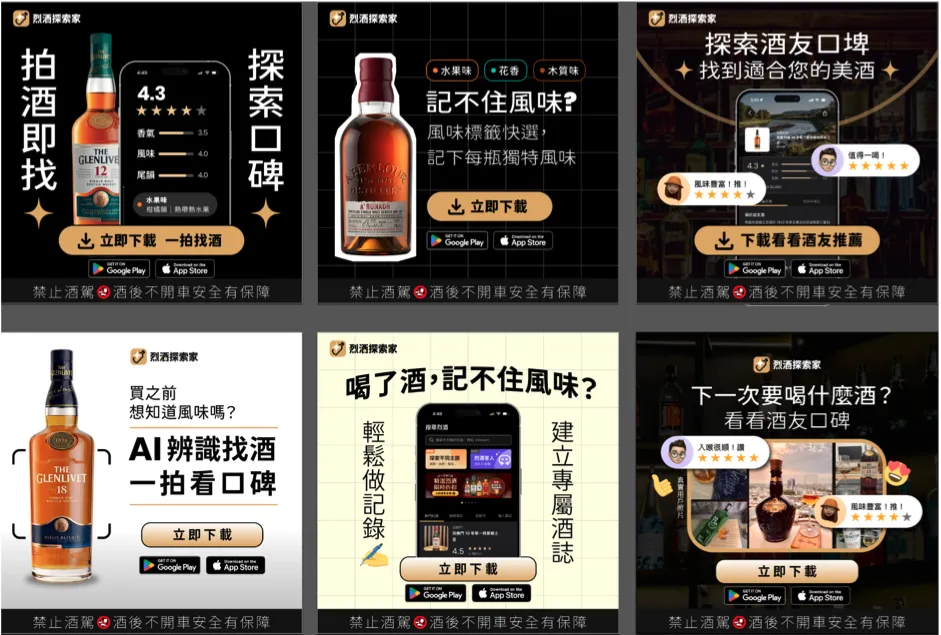
Ad material examples: build materials quickly using strategy and principles
Build and optimize distributor partner campaign pages
For the distributor partner campaign pages, the goal was to improve the coupon redemption conversion rate. After analyzing where users stayed and their click paths, I optimized the page's information hierarchy and CTA placement to lower the barrier to redemption.
Insight:
Although results improved after the redesign, this OMO activation had a core issue: redemption location and whether the offer felt valuable had a big impact. Still, it confirmed that the integrated model works and the online-to-offline redemption flow is smooth.
Conversion rate improved by 70 to 80%+
Users clicking to redeem increased by 10%+
Takeaways & What if continue
I was part of the full 0-to-1 product cycle, from design and research to operations. Every decision directly affected business metrics.
Lowering the barrier is not just about reducing fields. It means reducing the decision cost at every step.
When I set secondary ratings to expand by default, I judged that tapping stars had low enough effort that it would not feel like pressure. After launch, 95%+ of users filled it in, confirming that judgment. The real measure of a barrier is not the number of fields, but whether each step makes users hesitate.
The designer's boundaries are self-defined
On a four-person team, I took on backend reviews, built the SOP, and got involved in marketing and operations. None of that was in my job description, but it gave me first-hand data to make more accurate design decisions. Resource constraints can be opportunities to understand the bigger picture early.
Every design decision answers four questions
Does it meet user needs? Does the product benefit from it? Can the team validate the assumption? Does it help hit business metrics?
These four questions came up again and again in this project. The scan guide met user needs and improved accuracy to 90%+. The backend review was not in my scope, but it directly affected the spirits listing metric.
What if continue
⭐
Separate professional ratings
Introduce expert and KOL verification to distinguish professional reviews from general ratings, so users can find reliable information.
#Acquisition #Retention #Potential Revenue
⭐
Personal recommendation system
A personal recommendation system, rankings, seasonal gifting, and more to improve the spirits search experience and increase return visits and new members.
#Active #Retention
Other functions
The following are other features I worked on. Feel free to ask about the design thinking behind them.
Acquisition
・Coupon feature
・Guided rating feature
・Ad material design
・Personality quiz
・Distributor partner campaigns x2
・EDM content design
・Share feature activation
Activation
・Scan feature
・Backend review feature
・User report feature
・AI chatbot for finding spirits
・Note feature
・Advanced search feature
Retention
・Topic exploration feature
・Personal achievement feature
・Quick note optimization
・Rating optimization
・Community feature
・Wishlist feature
Revenue
・Ad placements
Others
・ Logo design
・Admin backend features
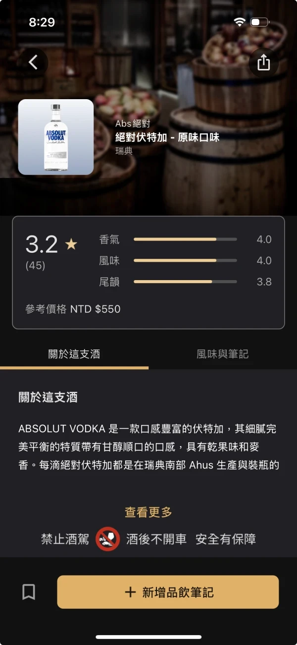
Spirits product detail
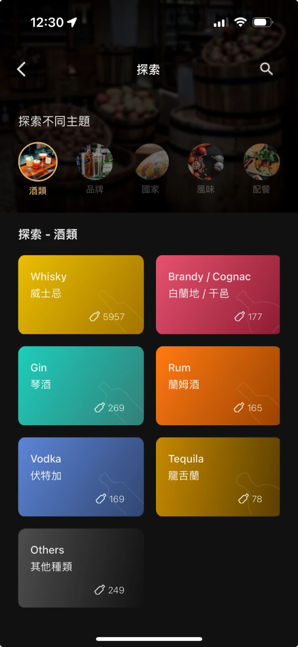
Flavor explore page
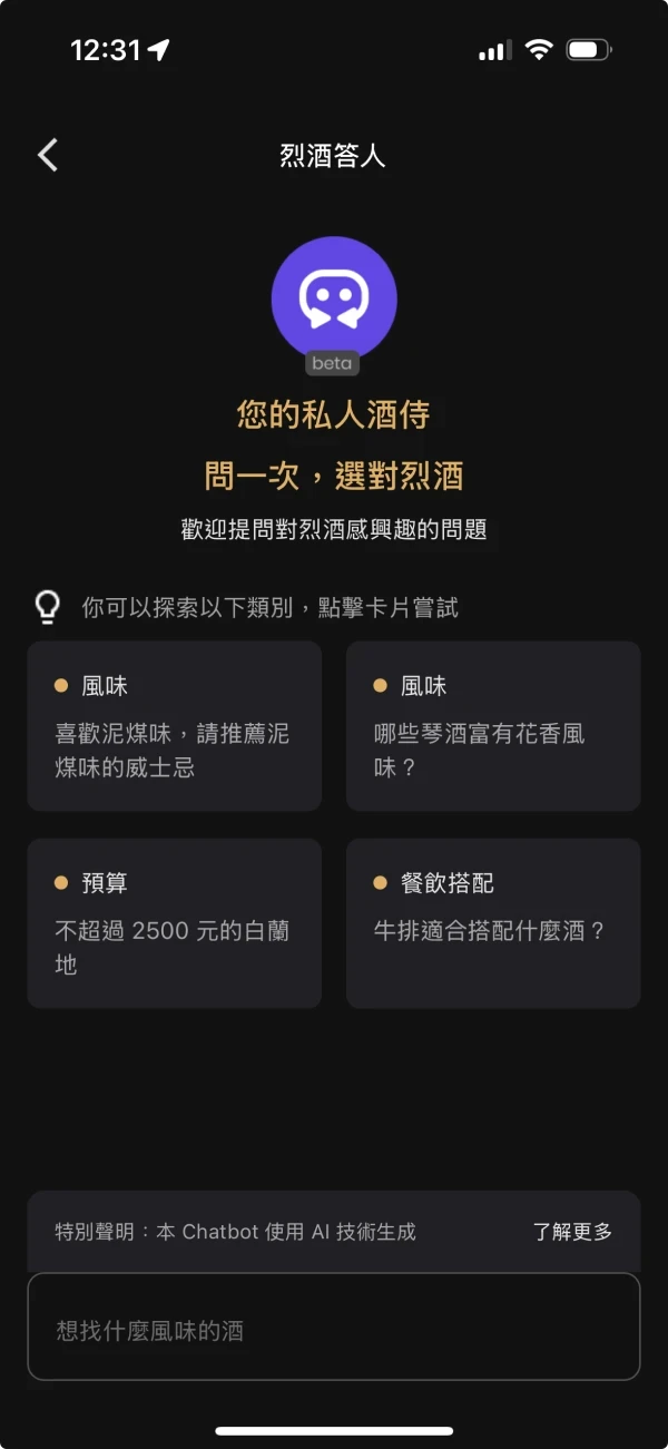
AI chatbot with prompt cards
" transform="translate(6 9)" width="12px"/></svg>)